IRIS: Designing a Co-Pilot That Actually Lets You Drive

IRIS: Designing a Co-Pilot That Actually Lets You Drive

IRIS: Designing a Co-Pilot That Actually Lets You Drive

How I challenged the industry's obsession with touchscreens to design a hybrid interface that reintroduces tactile controls, slashes cognitive load by nearly half, and finally treats driver attention as a finite resource

How I challenged the industry's obsession with touchscreens to design a hybrid interface that reintroduces tactile controls, slashes cognitive load by nearly half, and finally treats driver attention as a finite resource

How I challenged the industry's obsession with touchscreens to design a hybrid interface that reintroduces tactile controls, slashes cognitive load by nearly half, and finally treats driver attention as a finite resource

IRIS Infotainment System

Team

2 UX Designers, 2 Industrial Engineers

Date

January 2025 - May 2025

My Role

UI/UX Designer UX Researcher

Industries

Transportation, Vehicle Manufacturing

Overview 📝

This project involved the research, design, and rigorous evaluation of IRIS, a prototype for an in-vehicle infotainment system (IVIS) created to combat the significant safety risks of driver distraction. Modern touchscreen interfaces in cars often increase cognitive load and divert a driver's attention from the road. Our team designed IRIS with a focus on streamlining common tasks, balancing touch and physical controls, and reducing visual clutter. Through a comparative usability study against a leading competitor's system, IRIS was proven to be quantifiably faster, more efficient, and easier to use, demonstrating a clear path toward safer in-vehicle interface design.

Project Management & Version Control 💼

Core AR Implementation 🥽

Gameplay Programming 👨‍💻

Debugging 🪲

Problem❓

The widespread adoption of touchscreen infotainment systems in modern vehicles has introduced a critical safety challenge. By 2020, 97% of new vehicles in the United States featured a touch-sensitive screen. While convenient, these systems have been shown to increase the risk of a car crash by up to 4.6 times, a risk factor greater than fatigued driving.

This combination of factors results in substantial human and economic costs, underscoring the urgent need for more intuitive and safer interfaces.

Project Management & Version Control 💼

Core AR Implementation 🥽

Gameplay Programming 👨‍💻

Debugging 🪲

🎛️
Lack of Tactile Feedback
Touchscreens force drivers to look away from the road to visually confirm their actions
🎛️
Lack of Tactile Feedback
Touchscreens force drivers to look away from the road to visually confirm their actions
🎛️
Lack of Tactile Feedback
Touchscreens force drivers to look away from the road to visually confirm their actions
😵‍💫
Menu Complexity
Simple, frequent tasks often require multiple interaction steps and navigation through complex menus, increasing both cognitive and visual workload.
😵‍💫
Menu Complexity
Simple, frequent tasks often require multiple interaction steps and navigation through complex menus, increasing both cognitive and visual workload.
😵‍💫
Menu Complexity
Simple, frequent tasks often require multiple interaction steps and navigation through complex menus, increasing both cognitive and visual workload.
⚖️
Insufficient Regulation
There is a lack of sufficient regulatory oversight for these increasingly complex systems, making driver distraction a pressing issue for road safety
⚖️
Insufficient Regulation
There is a lack of sufficient regulatory oversight for these increasingly complex systems, making driver distraction a pressing issue for road safety
⚖️
Insufficient Regulation
There is a lack of sufficient regulatory oversight for these increasingly complex systems, making driver distraction a pressing issue for road safety

User 👤

To ground our design in real-world frustrations, we conducted 1:1 interviews with a diverse group of licensed drivers. This research revealed several key user needs and pain points that directly informed our design principles.

Simplicity for Core Tasks: Users expressed significant frustration with overly complex processes for simple actions. One participant noted the difficulty of scrolling through a long contact list to make a call while driving, stating, "This is not easy to navigate through... I write it down to deal with it after I get home".

Preference for Physical Controls: A strong theme was the desire for tactile, physical buttons for essential functions. Users feel physical buttons are more convenient and can be operated by feel without looking at the screen. One participant voiced a common concern: "if we don't have these manual buttons, if the system is broken, I cannot set the temperature or something".

Seamless Smartphone Integration: For many users, particularly tech-savvy ones, seamless integration with systems like Apple CarPlay is non-negotiable. One user stated, "CarPlay is essential," and that they would not like the system without it.

Process ⚙️

Our team followed a structured, four-phase process to move from identifying the problem to validating a solution.

Discovery & Research

We began with foundational research, including a literature review and 1:1 interviews with drivers to gather qualitative data on their experiences and frustrations with existing IVIS.

Ideation & Principles

Based on our research, we established three core design principles: optimizing task efficiency, balancing touch with physical controls, and minimizing visual clutter. These principles became the framework for all subsequent design decisions.

Prototyping

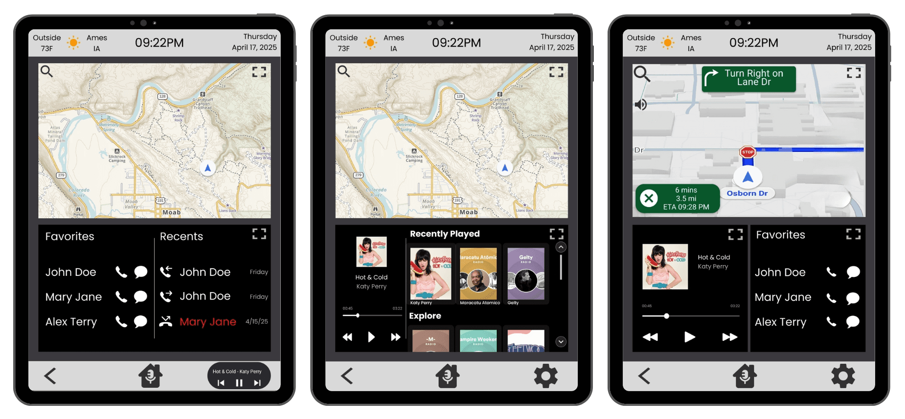
We designed and built a high-fidelity, interactive prototype in Figma called IRIS. The prototype focused on the three most common driver tasks identified in our research: communication (texting/calling), navigation, and music playback.

Evaluation

We conducted a formal, within-subjects usability study with eight participants, comparing IRIS to a simulated GMC infotainment system. We measured quantitative and qualitative data across several key metrics: Task Time, Tap Count, Lostness, Cognitive Workload (NASA-TLX), and Perceived Usability (SUS).

Final Design 🎨 & Rationale 🤔

The final design of IRIS directly addresses the user needs and challenges identified during our research phase.

Widget-Based Homepage: The home screen features persistent widgets for Navigation, Music, and Communication.

Rationale: This design eliminates deep menu navigation for the most frequent tasks, reducing the number of steps and allowing users to see multiple functions at once without switching screens.

Portrait-Oriented Display: The screen is oriented vertically.

Rationale: This ergonomic choice reduces the physical distance a driver must reach to interact with the far side of the screen, making it more accessible and comfortable to use.

Integrated Voice Assistant: A voice assistant, can be activated with a long-press of the home button or shout "Hey IRIS" to handle tasks like composing text messages.

Rationale: This provides a hands-free alternative to tapping on the screen, minimizing physical and visual distraction while driving. An onboarding tip helps users discover this feature.

Hybrid Control System: In addition to the touchscreen, the design proposed a minimal set of physical buttons for core media and volume controls.

Rationale: This was a direct response to strong user feedback indicating a preference for tactile controls that can be operated by feel alone, without looking away from the road.

Outcomes and Impact 📈

The comparative usability study produced statistically significant results, validating that the IRIS design is a superior and safer alternative to the baseline system.

These outcomes demonstrate that a user-centered design focused on efficiency and simplicity can lead to a direct and measurable improvement in driver performance and safety.

🚀

34% faster task completion

IRIS was significantly faster and more efficient. Average task completion speed increased significantly (34%), with complex navigation tasks improving by 42%

👆

51% fewer taps needed

IRIS required few taps to operate by streamlining workflows. This reduced physical interactions by 51%on average, slashing "eyes-off-road" time.

👍

75% users choose IRIS

IRIS was rated as more usable and was the clear favorite. After testing both systems, 75% of participants (6 out of 8) stated they would choose IRIS for their own vehicle, compared to just one who preferred GMC and one who preferred neither.

🚗

25% better usability

IRIS achieved a statistically significant higher System Usability Scale (SUS) score compared to the GMC baseline.

🚀

34% faster task completion

IRIS was significantly faster and more efficient. Average task completion speed increased significantly (34%), with complex navigation tasks improving by 42%

👆

51% fewer taps needed

IRIS required few taps to operate by streamlining workflows. This reduced physical interactions by 51%on average, slashing "eyes-off-road" time.

👍

75% users choose IRIS

IRIS was rated as more usable and was the clear favorite. After testing both systems, 75% of participants (6 out of 8) stated they would choose IRIS for their own vehicle, compared to just one who preferred GMC and one who preferred neither.

🚗

IRIS achieved a statistically significant higher System Usability Scale (SUS) score compared to the GMC baseline.

25% better usability

What I learned 💭

Lessons Learned 🎓

The biggest lesson was the importance of designing for a diverse population. Our participant data showed that prior confidence with technology was a greater predictor of usability scores than age, reinforcing the need to create interfaces that are intuitive for everyone, not just "power users". We also learned that even with a strong design, there will always be limitations and it is nearly impossible to design a single interface that 100% of users will love.

Limitations 🚧

Our study's primary limitations were the small sample size (8 participants), the lack of a real-world driving environment (testing occurred in a quiet, stationary room), and a prototype that only addressed three main tasks. This controlled setting does not fully mimic the dynamic and distracting conditions of actual driving.

Future Recommendations 🔮

If this project were to continue, the next steps would be to expand the prototype to include more functions (like climate controls), test the interface in a high-fidelity driving simulator or a real vehicle, and recruit a much larger and more demographically representative sample of participants to strengthen the results.

Explore More Works

Explore More Works

©dtang 2026

"To improve is to change; to be perfect is to change often" - Winston Churchill

©dtang 2026

"To improve is to change; to be perfect is to change often" - Winston Churchill

©dtang 2026

"To improve is to change; to be perfect is to change often" - Winston Churchill